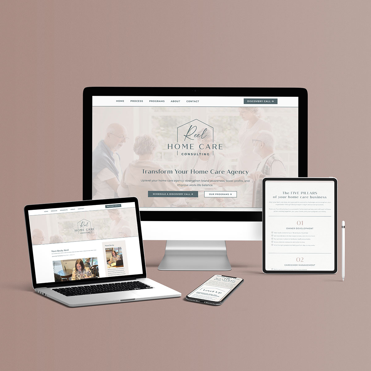
Reel Home Care Consulting
Becky Reel is a home care consultant committed to helping business owners and executives find work-life balance by creating processes and structures to scale their business to the next level.
She helps her clients align their team, services, and approach to overcome challenges and strengthen their organization. Through her years of experience in the home agency industry, Becky also comes alongside you and your loved ones to find quality care.
The Brand
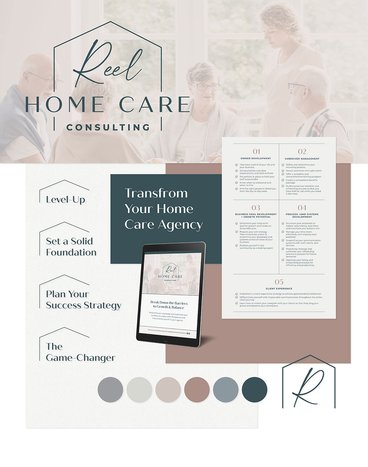
When developing Becky’s logo, we kept in mind her brand tone of approachable, clarity, connection, and inspiration by introducing the script font and pairing it with the simple serif font. We used blue tones to incorporate the meaning of healing, hope, and clarity. We planned to use salmon and pink tones to add the joy and fun element and gray tones to create a clean, simple look.


